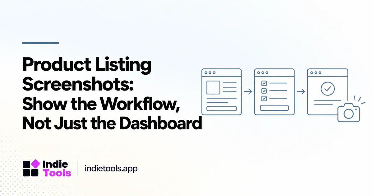
Product listing screenshots should help a visitor understand what they can do with the software. A polished dashboard is not enough when the buyer still cannot identify the input, the action and the useful result.
For a directory listing, choose a small sequence that explains the core workflow without requiring a sales call. The best sequence depends on the product; it should demonstrate a real capability rather than imitate the visual style of a more established competitor.
Start with the question the image must answer
Write one question for each screenshot. Examples include “How do I add the first request?”, “What does the generated output look like?” and “How can a teammate review the result?” If an image does not answer a useful question, it may be decorative rather than informative.
Do not use the homepage hero as the only product image when it repeats the same headline already visible in the listing. Show the application or output that explains the promise.
Build a short workflow sequence
A useful sequence can show the starting input, the action in progress and the resulting output. For a feedback tool, that might mean submitting a request, reviewing the queue and connecting an item to a release.
Keep the examples coherent across frames. Changing projects and sample accounts in every image forces the reader to reconstruct the story. A consistent example makes the workflow easier to understand without adding long captions.
Use safe, credible sample data
Create a demonstration workspace with fictional or appropriately authorized content. Remove private customer information, credentials and operational details. Do not present fictional revenue, user counts or endorsements as real business results.
Label mock data when it could be mistaken for evidence. A realistic-looking chart can help explain an interface, but it should not imply that the company achieved those results. Accuracy is more important than making every number look impressive.
Caption the behavior and its conditions
A caption should explain what the image shows and any important availability limit. “Export a filtered list as CSV” is more useful than “powerful dashboard.” If the feature requires a particular plan, say so where that condition affects the decision.
Use meaningful alternative text for informative images, adapted to their purpose rather than stuffed with keywords. W3C's accessibility guidance for images explains how text alternatives depend on an image's role in the page. [1]
Balance clarity and loading cost
Crop unnecessary interface chrome while preserving enough context to orient the viewer. Ensure important text remains readable at the displayed size. Avoid squeezing several unrelated screens into a collage that looks attractive but cannot be inspected.
Prepare appropriately sized, compressed assets and verify the listing on a phone. The image should not make the page difficult to use before the visitor reaches the product description. A clear screenshot that loads reliably is more useful than an oversized promotional composition.
Refresh images when the workflow changes
Assign screenshot review to significant interface or feature changes. Old images can make a current product appear inconsistent with its own documentation and increase uncertainty for a new user.
For IndieTools, pair screenshots with a precise category and product explanation so the visitor understands both the type of tool and its specific workflow. The site's category structure provides the browsing context; the images should supply the product-level evidence. [2]
Frequently asked questions
How many screenshots should a listing include?
Use enough to explain the main workflow within the platform's limits. A few distinct, readable images are more useful than many repetitive dashboard views.
Should marketing annotations be added?
Small annotations can clarify an action, but they should not hide the interface or introduce claims the product cannot support. Keep the screenshot understandable without excessive labels.
Can AI-generated interface images represent the product?
Do not present an invented interface as an actual screenshot. Concept visuals must be clearly labeled and should not replace evidence of a feature that visitors expect to use.
Explore related IndieTools resources: founder updates and releases.
Continue your research
- Design Tools for Accessible SaaS Onboarding
- Consistent Product Descriptions Across Directories
- Turn Release Notes into Useful Directory Updates
Sources and verification
Sources consulted for this article on October 1, 2026. Product capabilities are documented claims unless an actual test is explicitly described.