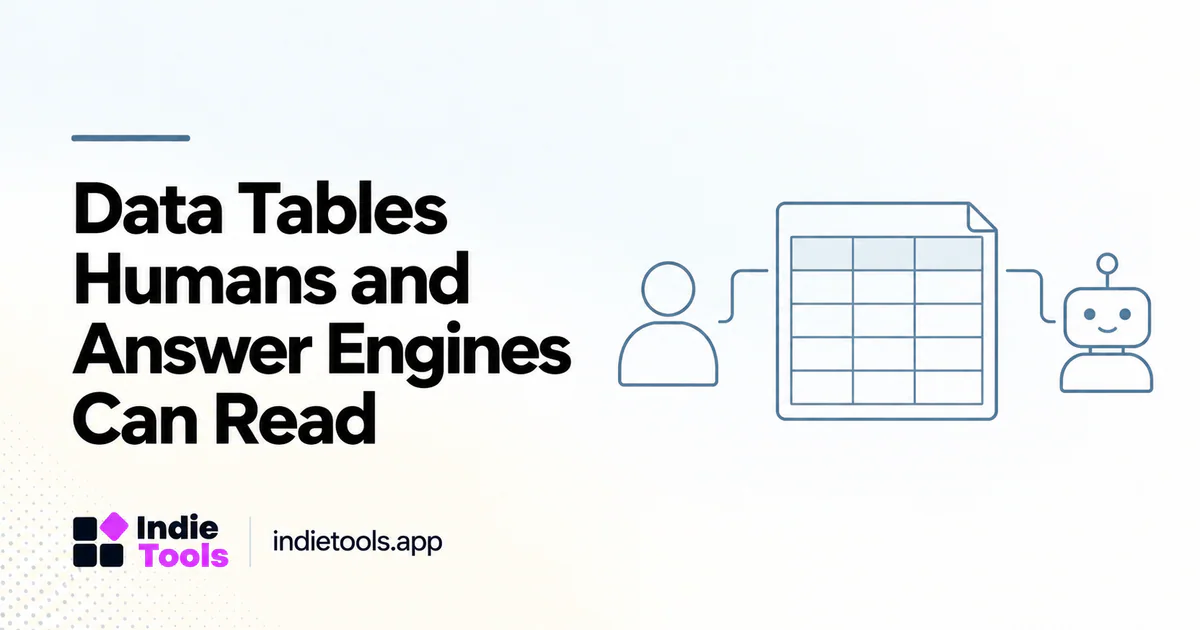
A useful data table should remain understandable when a reader encounters one row outside the surrounding article. Clear column names, units, dates and scope make the information easier to evaluate without requiring the reader to reconstruct hidden assumptions.
This is especially important for software comparisons and performance benchmarks. A visually attractive table can still be misleading when it mixes laboratory scores, real-user metrics, list prices and unverified product claims as if they were equivalent measurements.
Name the observation, not just the number
A column labeled “Speed” is ambiguous. A column labeled “Mobile Lighthouse Performance score” identifies a particular measurement more clearly. Add the test date and relevant conditions near the table rather than relying on a general explanation several screens away.
For a comparison table, distinguish a monthly price billed annually from a month-to-month price. If a feature exists only on a specific plan, include that condition where the feature is shown. Precision in the table prevents an otherwise accurate article from making an inaccurate comparison.
Make the structure accessible
Use an actual HTML table for genuinely tabular relationships, with appropriate headers and a useful caption. W3C's tables guidance explains how structural markup helps users understand the relationships between cells. [1]
Do not rely on color alone to indicate availability or confidence. A textual label such as “not verified” communicates more than a pale gray cell. On smaller screens, preserve access to headers when the table scrolls or changes layout so values do not become detached from their meanings.
Separate missing values from zero
A missing speed measurement is not a score of zero. An unknown price is not a free plan. A blank support-language field does not establish that English is unsupported.
Choose explicit labels for these states and document them in the caption or methodology. Keep numerical calculations restricted to eligible observations. When reporting an average or median, state how many records contributed and how many were excluded for missing or incompatible data.
Add provenance where the reader needs it
A product comparison can link a feature row to current documentation. A benchmark can identify the measurement provider and observation window. A table built from founder-reported data should say so, especially when readers might otherwise assume independent technical detection.
IndieTools' technology collections are useful for discovering reported stack choices. [2] A table derived from those collections should preserve that reported status instead of relabeling the entries as an independently verified infrastructure inventory.
Keep summaries faithful to the table
Write the explanatory paragraph after validating the data. If the table covers only a selected leaderboard, the paragraph should not describe all products in the directory. A displayed maximum is not a representative value, and a difference between two small samples is not automatically a meaningful general pattern.
For a hypothetical comparison of 12 eligible products, say “among these 12 products” rather than “across the SaaS industry.” The number is illustrative here; no such study is claimed. Narrow wording helps readers understand exactly what the evidence supports.
Plan updates and corrections
Give a changing table a responsible owner and a refresh rule. A broken evidence link, renamed product or changed plan should trigger review. Preserve a dated snapshot when the table supports a historical claim so future readers can distinguish the original observation from current data.
Machine-readable exports should carry the same units and missing-value definitions as the visible table. They should not silently include additional claims or broader coverage. Google's structured-data policies reinforce the need for accurate representations of visible content. [3]
Frequently asked questions
Do tables guarantee AI citations?
No. A table is a presentation choice. Its value comes from readable, supported information, not from a guaranteed response by a search or answer system.
Should every article include a table?
No. Use one when readers need to compare aligned attributes or measurements. Narrative explanations and sequential instructions are often clearer in ordinary paragraphs.
Can screenshots replace a data table?
A screenshot can illustrate an interface, but it is a poor substitute for accessible, selectable values when the task is detailed comparison or analysis.
Explore related IndieTools resources: weekly website speed measurements.
Continue your research
- Publish Original SaaS Benchmarks Responsibly
- Build a Citation-Worthy SaaS Benchmark Dataset
- Product Directory Schema: Choose the Right Type
Sources and verification
Sources consulted for this article on October 1, 2026. Product capabilities are documented claims unless an actual test is explicitly described.