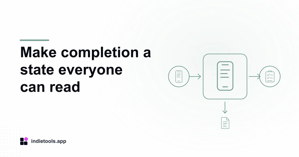
A progress checklist should communicate an item's name, its current state and the result of changing it without relying on colour or a tiny icon. Review those three pieces together with a screen reader before treating a mobile checklist as complete.
Pokopedia and Stardew Valley Tracker appear in the React Native catalogue, reviewed on October 3, 2026. Their listings describe independent game companions with progress features. They are examples of a relevant interaction pattern, not products that IndieTools has certified for accessibility.
Describe the task in ordinary language
Choose a short task such as finding an item, marking it complete and confirming the updated total. Use a disposable profile if available. A task gives the review a concrete finish point; inspecting isolated controls can miss whether the full sequence is usable.
Record the item's visible name and how the screen reader announces it. A generic “button” repeated throughout a long list forces the user to infer context that sighted users receive immediately. Names should identify the actual item without reading unrelated decorative content.
Check role and state together
React Native's accessibility documentation describes roles, labels and states such as checked, selected, disabled and expanded. These mechanisms support meaningful controls, but application code still needs to use them coherently.
Activate an item and listen for the result. The announced state should agree with the visible state and the saved progress. A changed colour alone is insufficient for someone who cannot see it, and a label that includes yesterday's state can be misleading after an update.
Keep the state separate from the action's explanation. For example, the control should make clear what is currently complete and what activating it will do. The exact wording can vary; consistency across the list is more useful than a clever phrase.
Follow focus through a changing list
Filter to incomplete items, mark one complete and observe where focus goes when that row disappears. The user should retain a understandable place in the workflow rather than being sent to the beginning without context.
Then open an item detail view and return. Check whether the app restores a useful position in the list. For a large collection, losing that position after every inspection can make an otherwise labelled interface difficult to use.
Run the task with the platform's actual assistive technology. Shared components do not establish identical VoiceOver and TalkBack behaviour, so report the platform and settings that were tested.
Include larger text and interrupted work
Increase the device's text size through supported settings and inspect names, counts and controls for clipping. A checkbox that remains tappable while its label disappears has not preserved the full task.
Switch away from the app and return during the review. The user should still be able to identify the current item and saved state. The companion offline progress review examines persistence and synchronization in more detail.
Keep findings scoped to the tested version, task and device. A passed checklist is useful evidence for that workflow; it does not establish complete accessibility across every screen or a legal compliance certification.

 Stardew Valley Tracker
 РАЗНОС (Raznos)